|
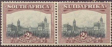
YEAR: 1927 PRINTING: Recess COLOURS: Maroon and Grey. SG# 34. Sc# 26 |
|
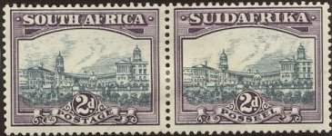
YEAR:(1) 1931.(2) 1938 PRINTING: Rotogravure COLOURS:(1931) Slate-grey and Lilac. SG# 44. Sc# 36. COLOURS:(1938) Blue and Violet. SG# 44d. Sc# 37. NOTES: Redrawn to include War Memorial (just above the left half of the figure "2". The sky is more defined.) |

|
YEAR:(1) 1938.(2) 1941. PRINTING: Rotogravure COLOURS:(1938) Blue and Violet. SG# 58. Sc# 53. COLOURS: (1941) Grey and Dull Purple. SG# 58a. Sc# 54. NOTES: Redrawn to hyphenate "SUID-AFRIKA". English Language stamps have slimmer lettering in "SOUTH AFRICA". |

|
YEARS: 1945, 1946, 1950. PRINTING: Rotogravure partially and fully screened. COLOURS: Slate and Violet, or Bright Violet, Slate-Blue and Purple. Many Shades. SG# 107, 107a, 116. Sc# 55. NOTES: Redrawn; the whole picture is more photographic rather than drawn. Buildings are seen from directly in front. Clouds are more natural. Frame is coarser with fewer, thicker, lines. |